Owner’s Manual
Table of Contents
Last Updated: December 13th, 2022
Managing Content
Preview Content and Tagging
Preview content typically includes a featured image, title, excerpt, and possibly some detailed text about the author and publication date. This content is important because it is your visitor's first impression when they see your content on social channels, search engines, and even feeds within your own website. For more SEO tips and tricks, go to the SEO with Yoast section.
Add An Excerpt
At the very bottom of any piece of content, you should see a field called Excerpt. If you do not, you can find Screen Options in the very top right corner of your editing window. These options enable you to hide or show fields that may or may not be relevant to you. Ensure the Excerpt fields is checked. Excerpts are typically 150 to 160 characters in length to align with SEO (Search Engine Optimization) best practices.

Tagging Content
In any content type, you should see several taxonomies including, but not limited to, Categories, Tags, Resource Types, and Featured Areas. These can be found in the right sidebar under publishing options. There are many different reasons to tag content, but typically they are used to narrow down the content that is filterable or dynamically generated.
- Categories are typically available for any content type and act as a general bucket for any miscellaneous use-case.
- Topics are specifically used to enable users to filter content based on a particular area of conversation. Example: Education, Healthcare, etc.
- Specialty Areas determine the kind of expertise for the content as it relates to specializations in your industry. (Example: Sleep Medicine, Pediatric Otolaryngology, etc.)
- Audiences define the age group or demographic that is intended for the content. (Example: Physicians, Students, etc.)
- Resource Types are specific to Resources and are used to filter content by the kind of media. Example: Infographics, Videos, Reports, etc.
- Featured Locations are used to featured specific content throughout your site and are not used to enable users to filter your content. Please note that you may need to uncheck previously added features in order to allow the correct content to appear in the featured block. Example: Feature on the homepage, Feature in navigation.
- Tags are the exception to the rule. They are strictly used for SEO purposes and are not used to filter content. Add tags or keywords to a post so search engines can get a better understanding of your content.
News Articles
News allows you to manage and edit your in the news and press release content. Click News in the left sidebar of your dashboard and then Add New to create a new news article.

First, add a title for the article. This will be the main title of your post and will be used to generate a link to the content. Then, add your main body content using the WYSIWYG (What You See Is What You Get) editor. For more information about the WYSIWYG, check out this in-depth breakdown of the WordPress WYSIWYG. Finally, select any categories/taxonomies that apply to the post and upload a featured image. The featured image is the graphic that is used when the post is shared on social channels and in filterable lists throughout the site. The ideal image size is 1200px wide and 630px tall.

Adding A Source
If you do not want to host the content on your site, and instead would prefer that users arrive at the original article, you can add the source article URL to the External Link field. Your custom featured image, excerpt, and title will still appear in filterable lists throughout the site.
Review the descriptions of any other fields to enhance your content.
Publishing A News Article
Once you are ready to review your updates, you can click the Preview button in the top right corner of the screen, under your publishing options. This will allow you to see what the page will look like before publishing.
When you are ready to publish your content, you can click the blue Publish button to post the content immediately or select a date and time to schedule your post. Please note that times are set in military time, so if you would like a blog post to publish at 3pm, you would need to set the time to 1500.
Team Members
Team Members allow you to manage and edit your staff and board of director bios. Click Team Members in the left sidebar of your dashboard and then Add New to create a new bio.

First, add the name of the team member in the title field. If you would like your team members to arrange by the last name, add their name as follows: "Last Name, First Name". Then, add your main body content using the WYSIWYG (What You See Is What You Get) editor. For more information about the WYSIWYG, check out this in-depth breakdown of the WordPress WYSIWYG. Finally, select any categories/taxonomies that apply to the post and upload a headshot to the featured image. The ideal image size for these headshots is 360px wide by 540px tall.
Review the descriptions of any other fields to enhance your content.
Publishing A Team Member
Once you are ready to review your updates, you can click the Preview button in the top right corner of the screen, under your publishing options. This will allow you to see what the page will look like before publishing.
When you are ready to publish your content, you can click the blue Publish button to post the content immediately or select a date and time to schedule your post. Please note that times are set in military time, so if you would like a blog post to publish at 3pm, you would need to set the time to 1500.
Events
Events allow you to manage and edit your conferences, webinars, and more. Click Events in the left sidebar of your dashboard and then Add New to create a new event.

First, add an event title. This will be the main title of your event and will be used to generate a link to the content. Then, add your main body content describing the event using the WYSIWYG (What You See Is What You Get) editor. For more information about the WYSIWYG, check out this in-depth breakdown of the WordPress WYSIWYG. Finally, select any categories/taxonomies that apply to the event and upload a featured image. The featured image is the graphic that is used when the post is shared on social channels and in filterable lists throughout the site. The ideal image size is 1200px wide and 630px tall.
Scheduling Your Event
Scroll down to find the Scheduling Options section that allows you to add a start date, end date, start time, end time, location, and timezone. Using these options allows past events to be removed from any upcoming events feeds on your site automatically. If you would prefer that past events are removed from your site completely after the ever, you can schedule an expiration date under Publishing Options.
Review the descriptions of any other fields to enhance your content.
Publishing An Event
Once you are ready to review your updates, you can click the Preview button in the top right corner of the screen, under your publishing options. This will allow you to see what the page will look like before publishing.
When you are ready to publish your content, you can click the blue Publish button to post the content immediately or select a date and time to schedule your post. Please note that times are set in military time, so if you would like a blog post to publish at 3pm, you would need to set the time to 1500.
Resources
Resources allow you to manage and edit your infographics, reports, and more. Click Resources in the left sidebar of your dashboard and then Add New to create a new blog post.

First, add a title. This will be the main title of your resource and will be used to generate a link to the content. Then, add your main body content using the WYSIWYG (What You See Is What You Get) editor. This can be the full resource content or an abridged version. For more information about the WYSIWYG, check out this in-depth breakdown of the WordPress WYSIWYG. Finally, select any resource types that apply to the resource and upload a featured image. The featured image is the graphic that is used when the resource is shared on social channels and in filterable lists throughout the site. The ideal image size is 1200px wide and 630px tall.
Upload a Downloadable PDF
You can upload a PDF or other media along with custom button text. This is specific to the resource content type and can be managed in the "Resource Meta" section. The button will appear toward the top of the resource and will force download when clicked.
Review the descriptions of any other fields to enhance your content.
Publishing A Resource
Once you are ready to review your updates, you can click the Preview button in the top right corner of the screen, under your publishing options. This will allow you to see what the page will look like before publishing.
When you are ready to publish your content, you can click the blue Publish button to post the content immediately or select a date and time to schedule your post. Please note that times are set in military time, so if you would like a blog post to publish at 3pm, you would need to set the time to 1500.
Swift Slider
Swift Slider is where you manage the slides for your carousel, like the one on the homepage. Click Swift Slider on the left sidebar of your dashboard and then duplicate an existing slide. We recommend you duplicate an existing slide instead of creating a brand new slide so the slide settings are the same across all slides.
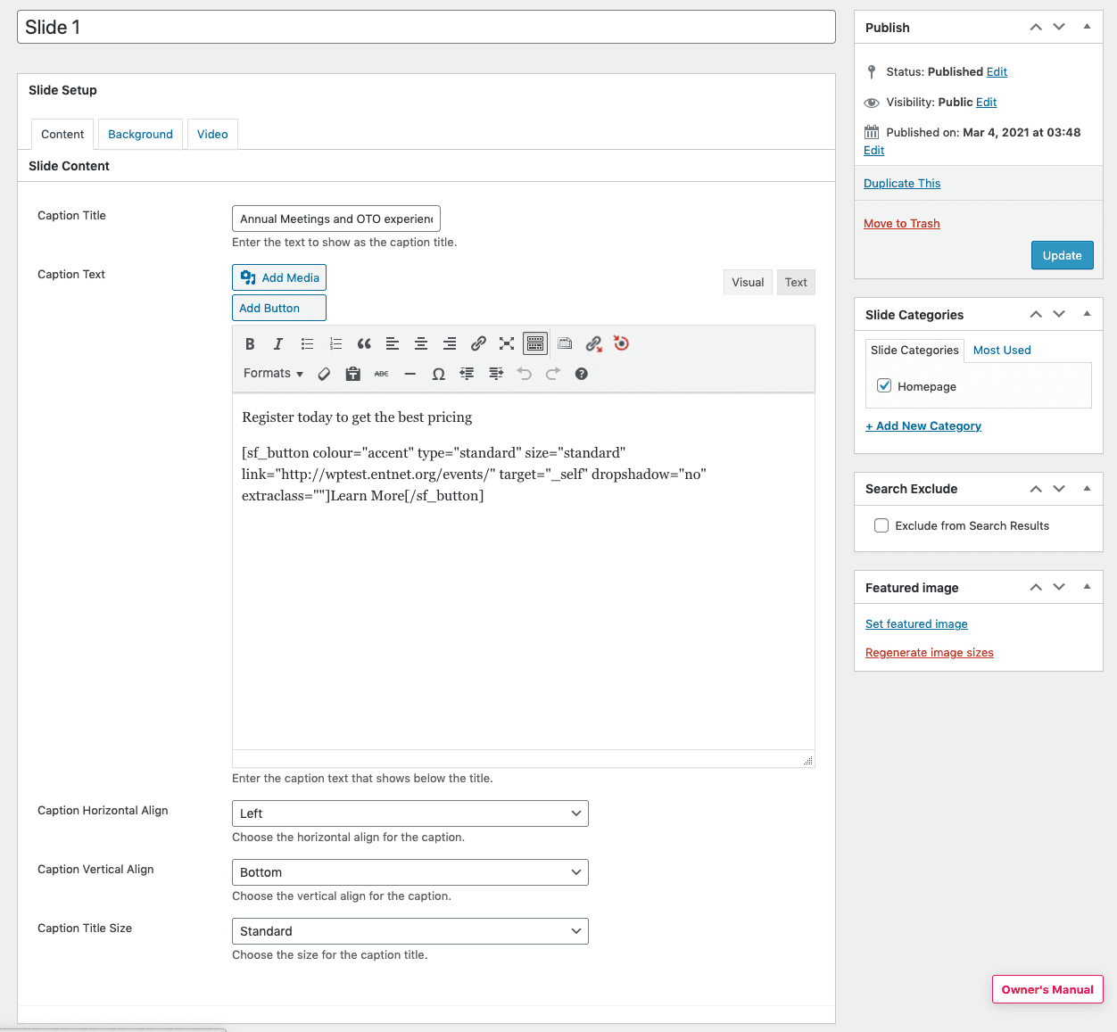
Edit the Slide and update the following fields: Caption Title and Caption Text under the Content tab and Background Image under the Background tab. The rest should remain the same. The recommended image size is 1600px by 700px. Most importantly, tag the new slide you created with the correct Slide Categories. If the new slide is for the homepage, make sure it is tagged with the Homepage slide category. You can create new Slide Categories if you want to display a carousel on a page that is not the homepage.
Replace the Default Header with a Carousel
The carousel display settings are located on the page itself. To remove the page default header, below the Title field, make sure Show Heading is not checked under Heading Options. Scroll down the page to Slider Options to set up your carousel. The settings should match the Slider Options on the homepage.
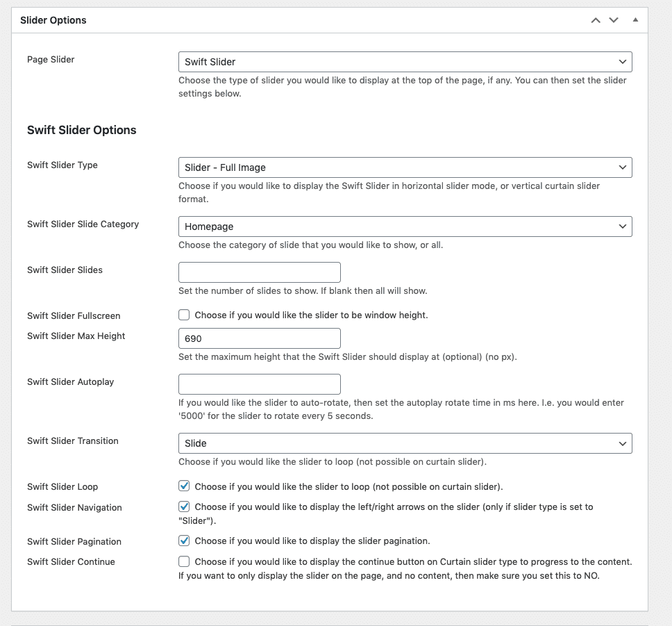
If you want the background images in the carousel to extend the full width of the page, the Swift Slide Type should be set to Slider - Full Image. If you want the background image to only take half of the page, set it to Slider - Half Image. Select the correct Swift Slider Slide Category so the correct slides display on the front end.
SEO with Yoast
SEO is an extremely important aspect of your site and something to consider whenever you update or add any new site content. We’ve installed a tool called “Yoast SEO” which will help guide you towards matching your site content with important keywords.

Using Yoast SEO
Content (Tab that looks like a traffic light)
- The Snippet Editor previews what your page looks like in a Google search result. Click “Edit Snippet” to update the SEO title, slug (also known as the URL), and the meta description.
- Focus keyword: chose the main keyword or phrase that matches the content on the page.
- Meta keywords: additional keywords that pertain to the page content
- Content analysis: Based on your focus keyword, the content analysis will analyze the page content based on a benchmark of checks to ensure the focus keyword makes sense. This includes an appearance in the URL, meta description, title length, etc.
Social (Tab that looks like sideways “v”)
This section enables you to personalize the social media title, description and image representation for Facebook and Twitter should you choose. For images, be sure to pay attention to the recommended sizes listed in the descriptions.
On-page Optimization
Title Tag
- Avoid duplicate title tags
- Keep title tags at 55 characters or less in length, including spaces.
- Your title tag should be written like this: Primary Keyword – Secondary Keyword | Brand Name
- Use a dash in between your keyword phrases and a pipe at the end before your brand name
Meta Description
- Write compelling meta descriptions (for CTR)
- 150 to 160 characters is the recommended length
- Avoid duplicate meta descriptions
- Do not use quotes or any non-alpha characters
- Use target keywords in the description
H1, H2, H3
- Use H1 Tag for Page title
- Use your keyword phrase once in your H1 tag
- Use H2, H3 tags for subheadings if there are multiple sections
Anchor Text
- When linking to another page on the same site from within content, select good anchor text (keywords) to use in the actual link and do this often. For example: “We offer *target keywords* services,” rather than “Click here.”
Image ALT tags and filenames
- Include your keyword phrase in the name of your image. Name all of your images in a way that describes what they are.
- Do not use non-alpha characters in your image or file names (no %, &, $, etc)
Footer Content
You can update the footer content by navigating to Widgets. Use the dropdowns under the "Footer Content" widget to find the content you would like to update. Once you have made the necessary updates, click Save.

Swift Page Builder
We’ve installed a feature called Swift Page Builder into your WordPress site. This will allow you to easily create design “elements” for any page. Elements can be thought of like building blocks – stack and customize them how it fits your needs. For more information on how these elements can be used in branded components, use the Asset Board for reference.
Swift Page Builder Basics
Click Pages in the left sidebar of your dashboard and then Add New to create a new page. Once you are on a page, click on the blue Swift Page Builder button to switch the editing view. Please note that the WYSIWYG should be in Visual, not Text mode when switching to Swift Page Builder.

Page Layouts
The first step before adding any content will be to create your layout by adding a row or column element to the page. These elements allow you to add spacing and group other elements together. You will have the ability to drag and drop text areas, buttons, dividers, and more into these layout areas.

Adjusting the width of an element
 When hovering over any element except for rows, you will see five icons. From left to right these are trash, save, duplicate, edit, and resize. To resize any element into columns, you simply click the resize handle and drag the element to where you need it to be.
Saving Elements
Individual element settings, rows, columns, and even full-page layouts can be saved for use across your entire site. Make sure to title the element to be as specific as possible so other content contributors know what it is. You can access your team’s full list of saved elements and pages by clicking the Saved Items button in your Swift Pagebuilder toolbar.
Publishing Content
Once you are ready to review your updates, you can click the Preview button in the top right corner of the screen, under your publishing options. This will allow you to see what the page will look like before publishing.
When you are ready to publish your content, you can click the blue Publish button to post the content immediately or select a date and time to schedule your post. Please note that times are set in military time, so if you would like a blog post to publish at 3pm, you would need to set the time to 1500.
Accordions and Toggles
Accordions and toggles are used to reduce the length of your page by hiding content until users choose to see it. The only difference between the two is that accordions are meant to hold several groups while toggles only hold one group. View functional examples at Social Driver’s page builder codex for Accordions, Toggles, and Tabs.

Once you add an element, you can use the edit icons to rename the sections. Similar to rows and columns, you can add any other page builder element inside of an accordion or toggle group.

Blank Spacers
Blank spacers allow you to add space in between elements horizontally. You can easily customize the space size across multiple screen sizes. Spacers that are set to use a global scope will use the standard website setting. Customize the space of this specific spacer by selecting local.

Buttons
Buttons are flexible and have several different customization options. For any media such as PDFs and images, be sure to add that to the Media Library to retrieve a URL. View functional examples at Social Driver’s page builder codex for Buttons.

Contact Forms
Contact Forms are added through the Gravity Forms plugins. You can manage these forms through the Forms tab in the left sidebar of the WordPress dashboard. Below you can find several resources to help you create a form. Once a form is created, you can add it to any page using the page builder element. View a functional example at Social Driver’s page builder codex for Contact Forms.
Gravity Forms Resources
Watch the tutorial below to get acclimated to Gravity Form building basics. For more advanced tutorials, check out Gravity Forms Video Tutorials.
Tutorial Agenda:
- 2:42 – 7:10 – creating a form
- 7:10 – 9:56 – basic form settings
- 9:56 – 11:00 – creating a dropdown field
- 13:33 – 14:38 – form confirmation settings
- 14:38 – 18:29 – form notification settings
Content Feeds
Content feeds are very powerful. They allow you to load dynamic content onto a page that can be filtered by many different facets. General options allow you to filter down the content that your visitors have the option to see. For example, if you select Posts from the Post Type dropdown, your feed will only contain blog post content. Visitors will not be able to see any other content type in that feed. View functional examples at Social Driver’s page builder codex for Content Feeds.

The Filters tab allows you to specify how your site visitors filter your content. You can choose simply keyword search or any taxonomy to display as a dropdown.

The Display tab offers different options for your content feed’s post previews. You can hide or show different content to offer the best user experience for your visitors.

Counters
Counters offer a simple way for you to show off your accomplishments and make your content more interactive through animation. You can provide a prefix or suffix to your animation such as “$” or “%”. View functional examples at Social Driver’s page builder codex for Data Visualizations.

Dividers
The divider element is fairly simple. You can use it to add a line between areas. It is one of many ways you can separate sections on your page.

Icon Boxes
Icon boxes allow you to add a variety of icons and emojis to your content to make it more engaging. View functional examples at Social Driver’s page builder codex for Icon Boxes.
Image Blocks
Image blocks enable you to make your images a bit more engaging with captions and hover states. View functional examples at Social Driver’s page builder codex for Images.

Raw HTML and JavaScript
Raw HTML & JS elements allow you to add embed codes to your website.

Search Bars
The Search Bar component adds a field to the page that when a user enters a search term and submits, will be brought to the site’s general site search with that keyword filtered.

Team Feeds and Tiles
Team members can be managed through the Team Members tab in the left sidebar of your dashboard. Once added, you will have the ability to either add a feed of team members or an individual team member tile to your page content. You can select the option to see the full bio in a modal or link to a separate page. View functional examples at Social Driver’s page builder codex for Team Members.

TablePress
TablePress is a plugin that allows you to manage tables without touching a single line of HTML code. It offers handy features like the ability to import data from a Google Sheet or CSV. You can see a demo of a TablePress table in action here.
To start, you will need to navigate to the TablePress section of the WordPress dashboard to add, edit, and manage your tables. You will only need to create your table once, and you will have the ability to feature that able on any piece of content throughout your website using the TablePress Swift Page Builder element. Please watch the tutorial below that goes over TablePress basics.
Tutorial Agenda:
- 0:00 – 1:00 – An intro to TablePress
- 1:30 – 6:00 – Adding a Table in Tablepress
- In this video they wanted the rows/columns to have links to the pages which is why they used the link URL
- You can just add regular text if you wish
- 6:00 – 7:30 – Adding the Table into a Page
- For this part, we use Page Builder so do not follow it. Reference the steps below to do this (starting at step 2)
- 7:30 – 9:00 – Editing a Table that was already made
- When inserting links, you can select an existing page or manually enter a URL.
- 9:00 – 10:00 – Wrap up – you do not need to watch this part

Accessing Your Website
Follow the steps below to access the dashboard of your WordPress website and begin managing your website.Log Into Your Website
Media Library Basics
The Media Library is where you can upload and manage your images and other documents all in one place. PDFs, Word documents, and graphics are all added to the media library for use throughout your entire website.Uploading + Link to Media
If you would like to upload a graphic, such as adding a picture to your post, then you must first upload the content to the Media Library. Once there, upload your image by clicking Add New, by choosing Select Files, or by dragging and dropping an image into the browser window. Once the file uploads completely to the list below, select the recently added thumbnail to reveal the image's full options. For SEO and accessibility purposes, it is highly recommended that you provide a descriptive Alt Text for the image. This text tells search engines and users using screen readers a bit more about the image's contents.
 You can use the URL provided in the top-right corner of the media settings on any other page throughout the site.
Editing Images
This section will describe how to use WordPress’s built-in image editor. If an image is saved in the media library and already in use, do not update this image. This may update it in other sections of the site. Add a duplicate and alter from there. Go to the Media Library section in the left sidebar. Click on an image in the list to view its settings. Just below the image click the Edit Image button. From left to right, you have options to crop, rotate to the left, rotate to the right, flip vertically, flip horizontally, undo, and redo changes to your image. If you wish to crop, drag your cursor over the image, to the proportions you would like visible, then click the crop button in the top left. If you do not like the change you have made, click the back or forward arrows.
If you would like to change the size of the image, update the New Dimensions in the right column under Scale Image. This will automatically scale your image proportionally and you cannot scale images up, only down.
From left to right, you have options to crop, rotate to the left, rotate to the right, flip vertically, flip horizontally, undo, and redo changes to your image. If you wish to crop, drag your cursor over the image, to the proportions you would like visible, then click the crop button in the top left. If you do not like the change you have made, click the back or forward arrows.
If you would like to change the size of the image, update the New Dimensions in the right column under Scale Image. This will automatically scale your image proportionally and you cannot scale images up, only down.